Standards Manual case study cover — wordmark and title on dark background
Company
Glydways
Project
Metro Visual System
Role
Principal Designer
Surfaces
Brand Guidelines
Signage & Wayfinding
Scripts
Accessibility Standards
Year
2024–2026
Overview
The Metro Visual System is the standard the network is held to — color, type, symbol, and contrast, fixed before any screen exists. It was built to read as civic infrastructure rather than corporate branding, and to survive translation into scripts it wasn't drawn in.

A passenger who shares no language with the sign still has to find the platform.
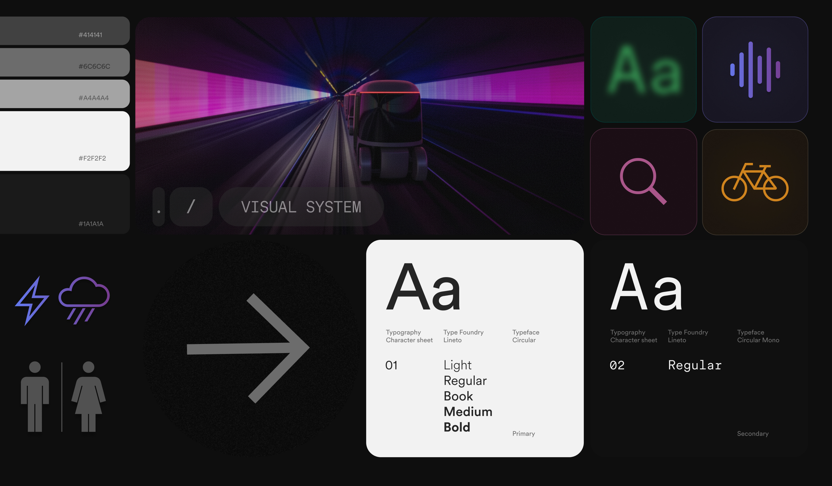
Visual system board — grayscale value ladder, a vehicle in a lit tunnel, weather and restroom pictograms, a wayfinding arrow, iconography tiles, and the Circular primary and mono character sheets
Principles
Simplicity

Reduce cognitive load at every moment of use, from first glance to completion.

Flexibility

Adapt to diverse cities, agencies, infrastructures, and operational conditions without breaking the system.

Universality

Work across cultures, scripts, and physical abilities, with accessibility as a default.

RoleFamilySize / LeadingSample
Statement Neue Haas Grotesk Displayweight 600 28–60px / 1.22 · −.01em Aa
Narrative Neue Haas Grotesk Displayweight 600 20–34px / 1.45 Aa
Brief value Neue Haas Grotesk Displayweight 600 16–26px / 1.4 Aa
Kicker Space Monoweight 400 14px / 1.6 · +.02em Aa
Label Space Monoweight 400 11px / 1.2 · +.14em Aa
Caption Space Monoweight 400 13px / 1.2 · +1px Aa
Swatch label Space Monoweight 400 14px / 1.2 · +.5px Aa

Neue Haas Grotesk Display carries every display and body role at weight 600, rendered as a white→gray gradient fill rather than a flat color — the signature Glydways treatment. Space Mono handles every kicker, label, and caption, same as the token plates above.

The two type families rendered on the same Dark Glass surface documented in Glassmorphism — component, not code, but built from the identical token set.

Aa
NEUE HAAS GROTESK DISPLAY WEIGHT 600 · STATEMENT / NARRATIVE / BRIEF VALUE
Aa
SPACE MONO WEIGHT 400 · KICKER / LABEL / CAPTION
Visual Framework

Built from the same circle: the mark, the typeface, and the vehicle share one language of arcs, extended into motion that stretches and merges rather than cuts. The pictograms are the counterweight — cut sharp, so information reads as information rather than as more brand.
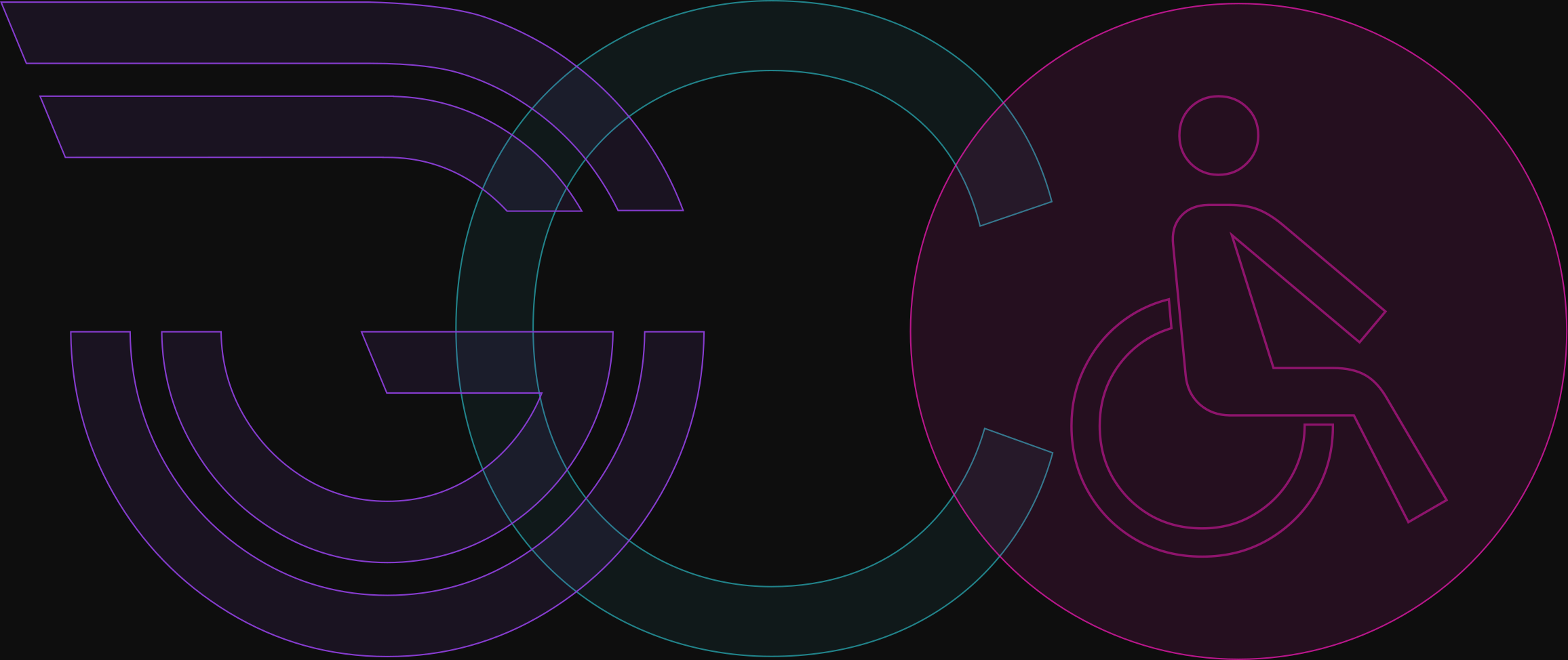
Construction — the mark, the typeface and the pictograms drawn from a shared geometry
Typography

Three families, one voice: Circular is drawn from the same circles as the mark, Noto carries the scripts it does not cover, and Zed sets the pictograms as type. All three are matched on weight and proportion, so no family drifts into a personality of its own.

Circular across five scripts — Arabic-Indic, Hebrew, Latin, Greek, Cyrillic
Scripts

Extended across scripts: Chinese, Japanese, Korean, Thai, Arabic, Cyrillic, and Greek, matched to Circular's weight and x-height rather than substituted at render time. What reads as official differs by culture, so each script was checked against native reference instead of scaled from the Latin.
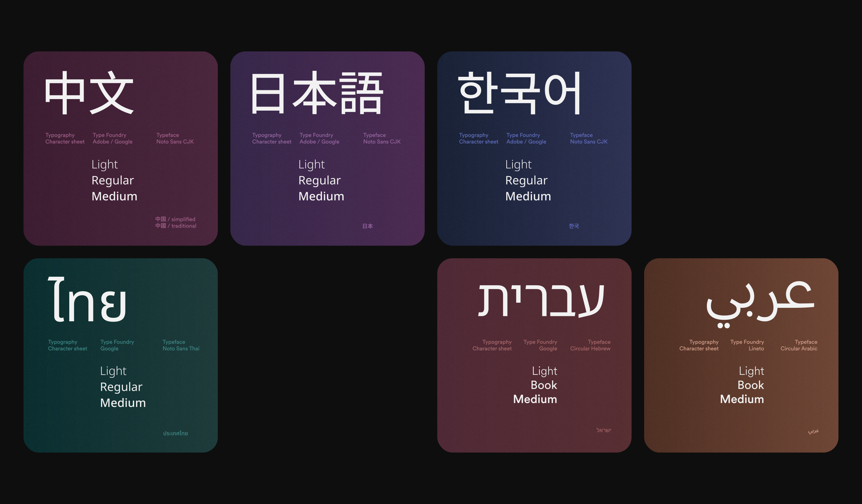
Typographic expansion — six specimen panels showing the type scale across weights and sizes
SpecimenScriptType FoundryTypefaceCharactersDirectionality
AaLatin ExtendedU+0000–017FLinetoCircular / Mono384 / 321LTR
ΕλGreekU+0370–03FFLinetoCircular144LTR
КиCyrillicU+0400–04FFLinetoCircular256LTR
עבHebrewU+0590–05FFLinetoCircular112RTL
عرArabicU+0600–06FFLinetoCircular256RTL
中文ChineseU+4E00–9FFFAdobe / GoogleNoto Sans20,992LTR
日本語JapaneseU+3040–30FF · KanjiAdobe / GoogleNoto Sans192+ KanjiLTR
한국어KoreanU+AC00–D7A3Adobe / GoogleNoto Sans11,172LTR
ไทยThaiU+0E00–0E7FGoogleNoto Sans128LTR

Characters are counted as Unicode block size — the range of character slots the system has to be able to receive, not the number of glyphs drawn. Japanese counts kana only; its Kanji are drawn from the same block as Chinese and are not counted twice. Circular carries 1,152 across 5 scripts; Circular Mono carries 321; Noto Sans carries 32,484 across 4.

Pictograms

Edged for balance: the pictograms are drawn sharp where Circular and the interface buttons are round, giving the system two registers instead of one texture. They favor resemblance over abstraction, because an arbitrary symbol has to be learned and a stranger on a platform has no time to learn one.
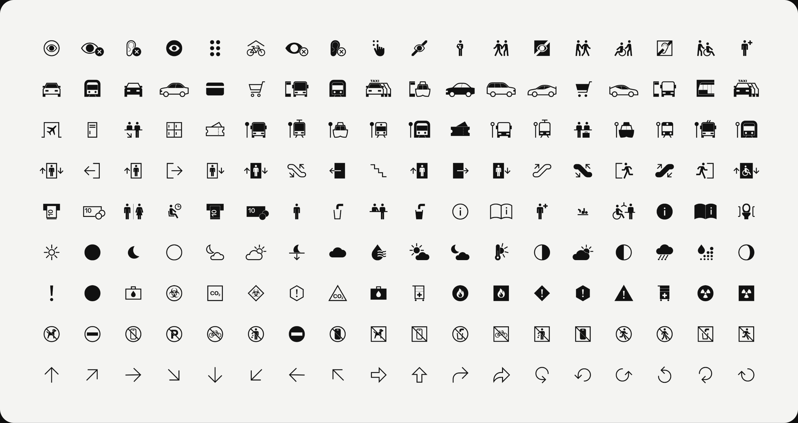
Pictogram set — accessibility, transit, wayfinding, amenity, weather, hazard, prohibition and directional rows
Where Language Stops

Counted on hardest: a rider who cannot read the sign, does not have the app, or cannot hear the announcement can still recognize the symbol. It is the only element in the system that assumes nothing about the person standing in front of it.

Accessibility

Held to a threshold: every text and control pair clears WCAG AA, and minimum type size is set per surface rather than per screen. What reads comfortably to a designer at a desk is too small and too low in contrast for a rider on a platform.

Text on #1A1A1A
Aa#F2F2F2hsl(0, 0%, 95%)15.55AA
Aa#A4A4A4hsl(0, 0%, 64%)6.98AA
Aa#828282hsl(0, 0%, 51%)Derived · L +94.53AA
Aa#507EE3hsl(221, 72%, 60%)Derived · L +84.50AA
Aa#AD66BFhsl(288, 41%, 57%)Derived · L +194.50AA
Text on #F2F2F2
Aa#1A1A1Ahsl(0, 0%, 10%)15.55AA
Aa#414141hsl(0, 0%, 25%)9.12AA
Aa#793989hsl(288, 41%, 38%)6.80AA
Aa#2D64DDhsl(221, 72%, 52%)4.71AA
Aa#6C6C6Chsl(0, 0%, 42%)4.69AA
Surface only — never text
#793989hsl(288, 41%, 38%)2.29
#2D64DDhsl(221, 72%, 52%)3.30
#A4A4A4hsl(0, 0%, 64%)6.98
#6C6C6Chsl(0, 0%, 42%)3.31
#414141hsl(0, 0%, 25%)1.70

Ratios measured against WCAG 2.2. Success Criterion 1.4.3 requires 4.5:1 for text; SC 1.4.11 requires 3:1 for non-text. Derived tints move lightness only; hue and saturation are unchanged. Surface values are measured on #1A1A1A.

Applications

One job each: Nova Purple identifies a line, light identifies a place, and the marks stay neutral so neither has to compete. On the platform that reads as a purple line, a halo canopy, and a level marker — a signal keeps working only while it means one thing.
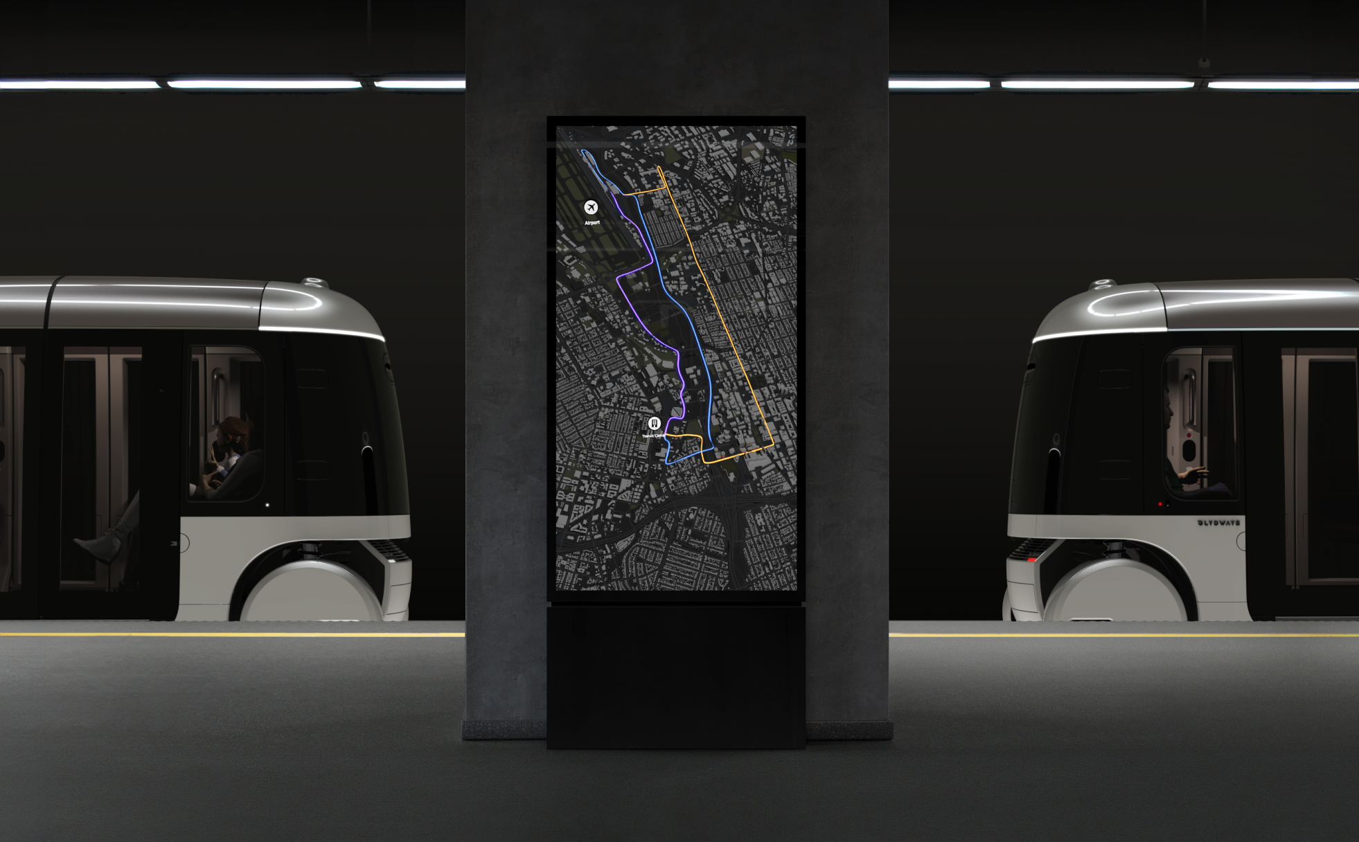
Station totem between two vehicles, the route shown as a purple line
Color identifies a line
Halo canopy lit above a platform at dusk
Light identifies a place
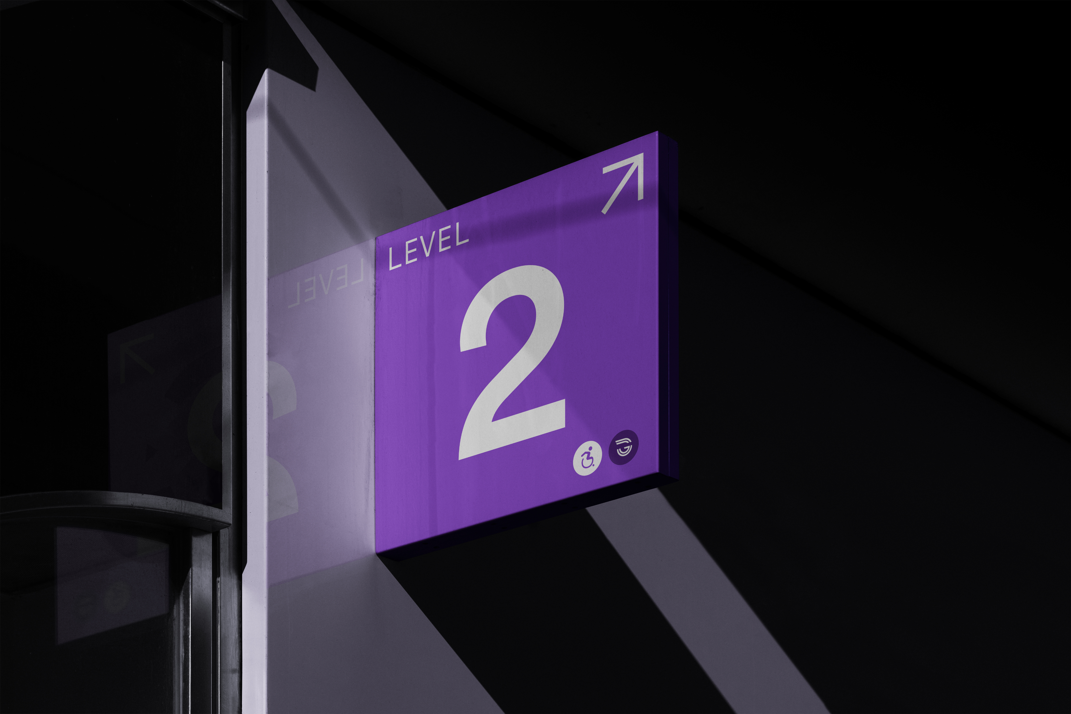
Level marker sign mounted overhead in a station
The mark stays neutral
The Outcome

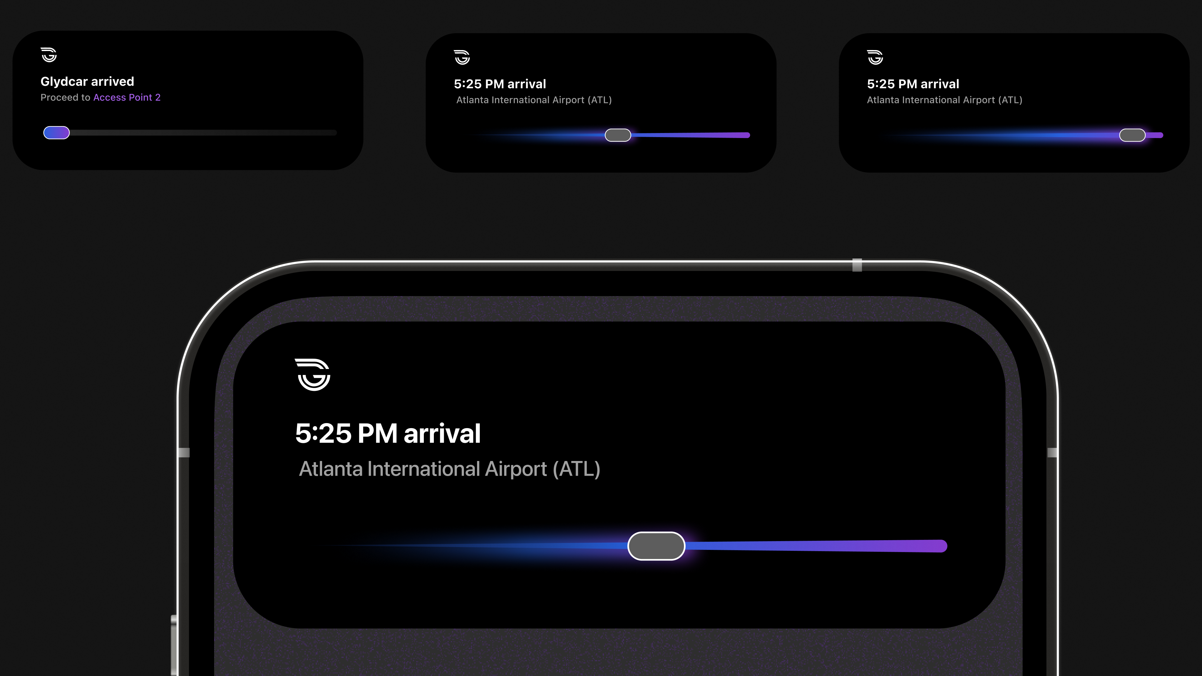
Carried through: a station sign, a vehicle exterior, and a phone screen resolve to the same five weights, the same scripts, and the same pictogram set. The stranger who arrives with none of the language still knows which way to go.
Lumasis design system coverGlydways Brand Guidelines cover