

%20Cover.avif)
Lumasis is the design system for an autonomous transit network, where the same value has to hold in daylight and after dark, on a vehicle, a platform, a kiosk, and in the control room. Every token states its own value, so the color a rider reads is the one an operator reads.
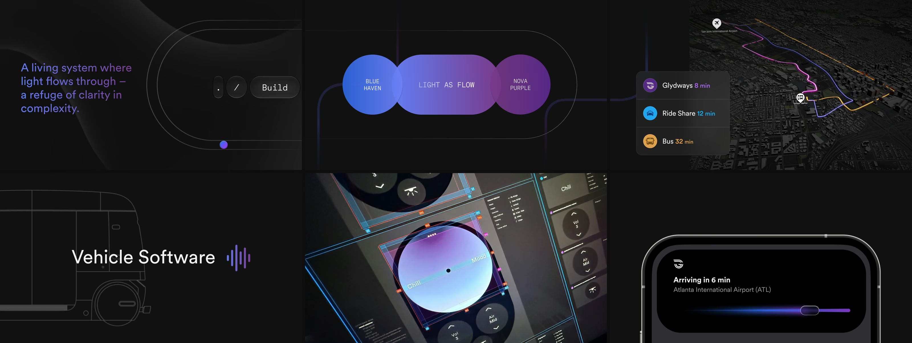
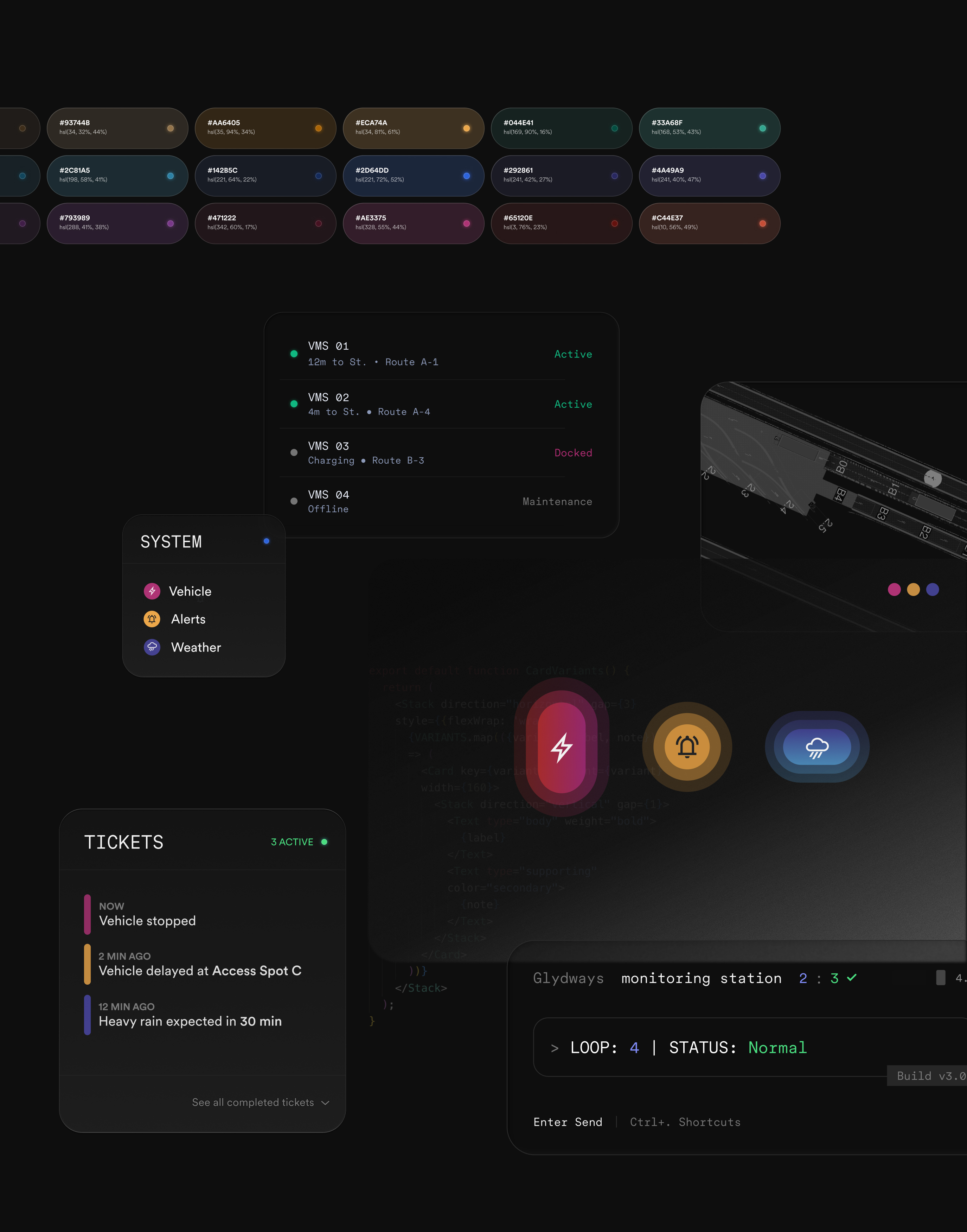
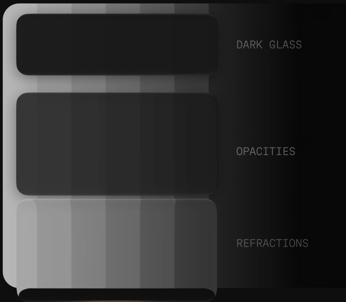
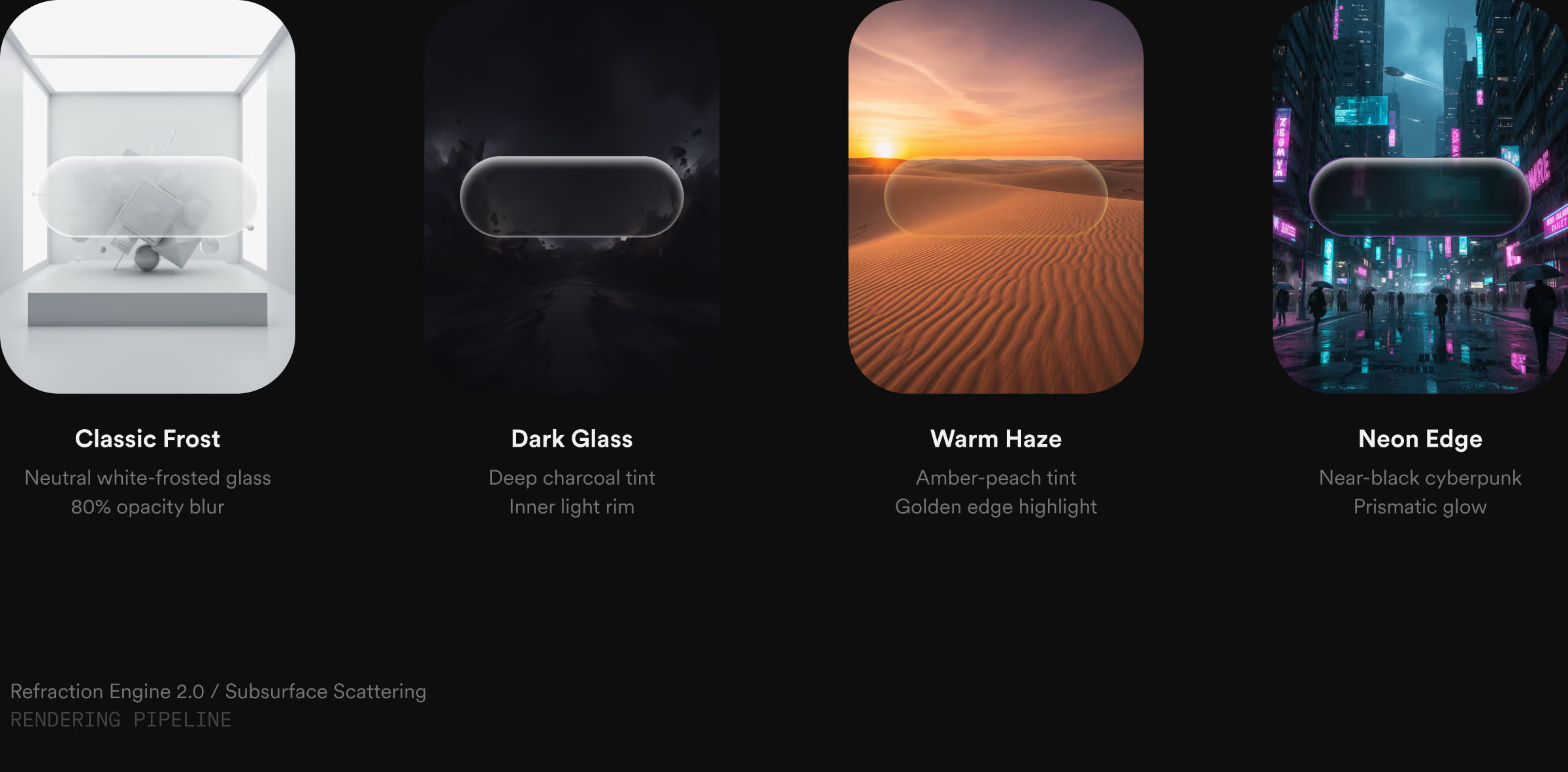
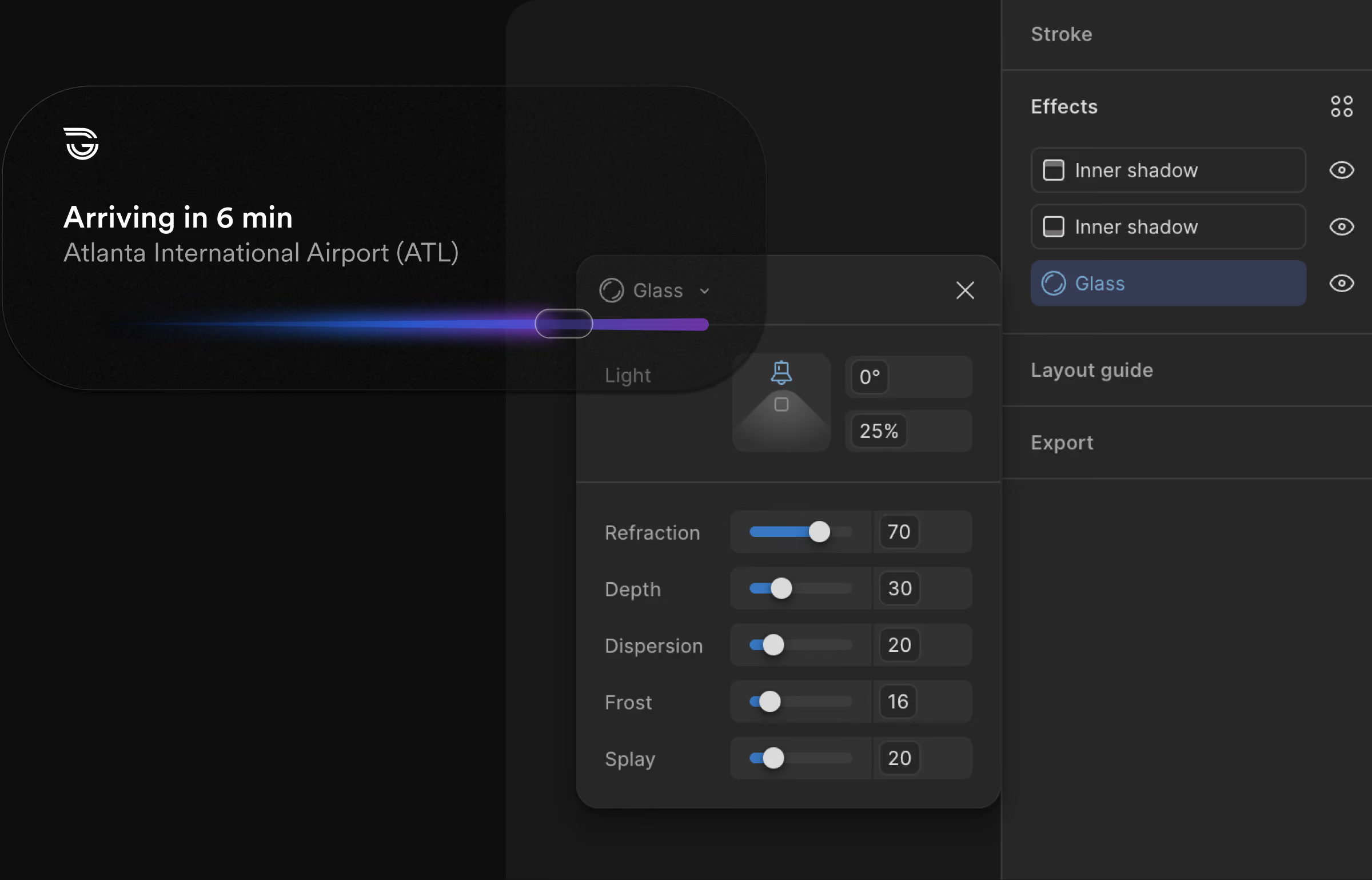
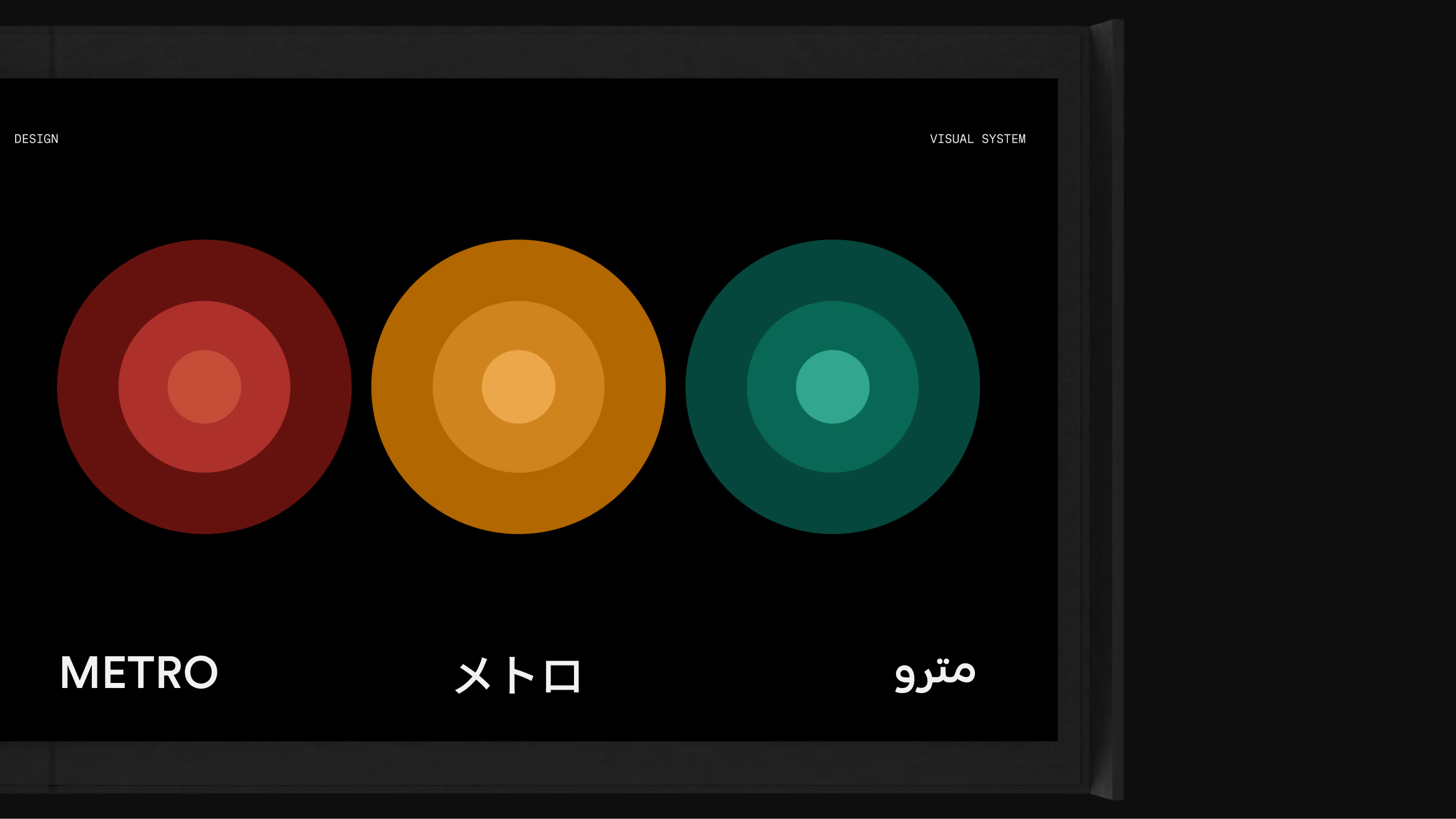
Type and pictograms came from Metro fixed, and stayed fixed, so they read the same on every surface. Color could not, because every surface runs in daylight and after dark and the same value has to hold through both. So color is the only parameter given a parametric build: light is that color read through glass, material is the glass, depth is opacity. The values themselves come next, each pair with the number it is checked on.
The plate lists the values; the stack says what derives from what. Four parameters, one object: the core is the only value anyone chooses, and everything above it is derived from that value or applied over it.
A dark theme with glowing accents has to clear WCAG AA[1] on every primary text and control; each applied value sits 18 to 30 points of lightness above its core.
Frosted, Dark, Tinted, and Prismatic all carry text at the same lightness-lifted values, so contrast doesn't reset depending on which surface a control lands on.
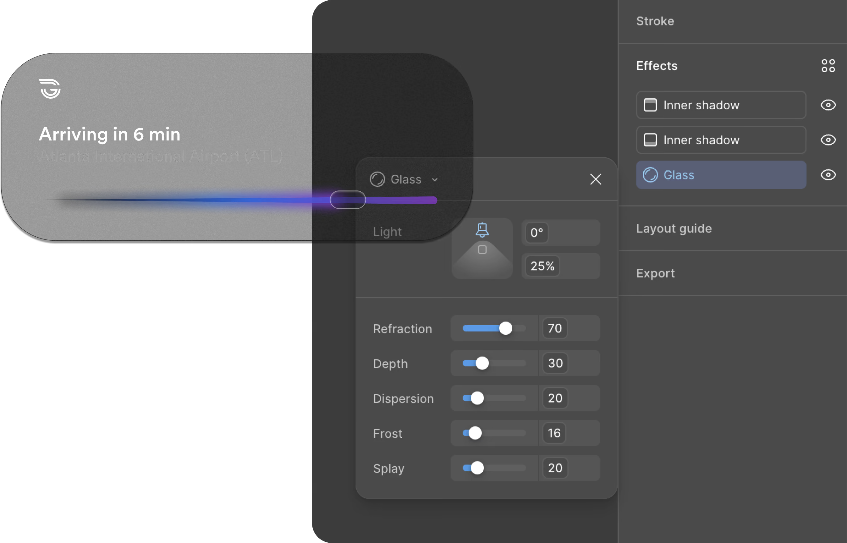
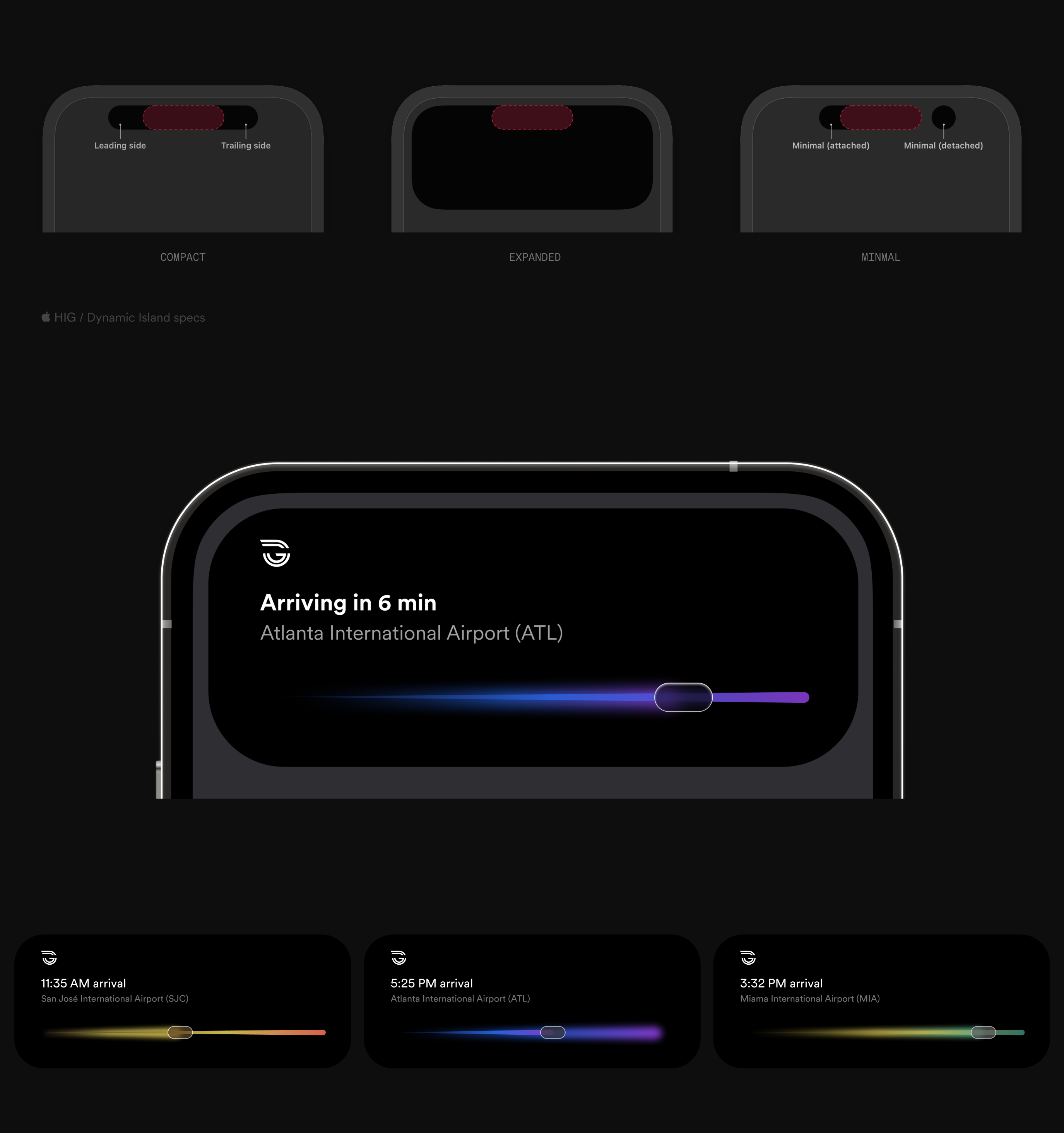
An operator watches two hundred vehicles move across three circuit maps. The field carries position and nothing else; everything the vehicle reports, and everything the system infers about it, opens in a window when the operator interrogates a dot. Status encoded into the dots themselves was rejected — legible at five vehicles, unreadable at two hundred.