Metaphors, Narratives & Structure
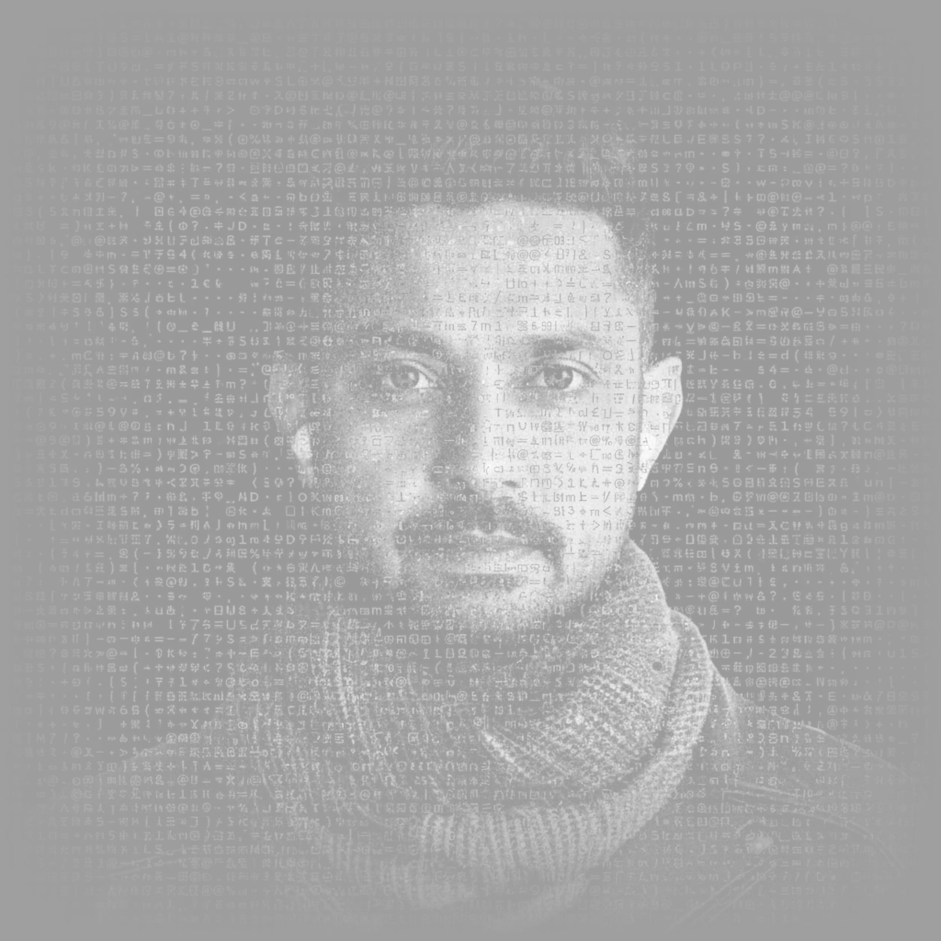
The portrait on the About page is a photograph, and it is also a field of type. Roughly seventy writing systems sit over the face — Devanagari, Khmer, Georgian, Cherokee, Tibetan, braille — drawn in the photograph's own grays so they read as its grain rather than as a layer laid on top of it. Nothing about it is generated. The likeness is the authored picture; the type is what happens to it when you look.
The page is built as three transparent sheets stacked in depth, with a camera looking through them. At the front are the scripts, the interpretive layer: the same face read through many languages. Behind them sits the portrait itself, untouched, dissolved softly inside its own square so no edge ever shows. At the back runs the field — punctuation and light scripts to the viewport's edges, the structure everything hangs on. Every input the viewer has — cursor, tilt, finger, scroll — moves the camera, never the picture. The sheets slide by different amounts, forty pixels at the front, twenty-two in the middle, eight at the back, and that difference is what the eye reads as depth.
At rest the scripts breathe between thirty and a hundred percent on their own phases, with a slow drift from left to right. A band of light crosses the face every nine seconds or so; single cells glint. On a desktop the cursor is the camera and also a heat trace: cells it passes over sharpen one band, brighten, warm to sand at the core, and fade over three seconds — a wake, like breath on glass. On a phone the tilt of the device is the camera, and a finger leaves the same trace. Scroll pulls the planes apart and fades them, so the wall of text that follows rises over a portrait that is already leaving.
The discipline is not in the parallax; it is in the ratio — enough separation that the planes are felt, never so much that the effect is seen. The same restraint governs the rest. Glyphs are fixed per cell and never re-roll; motion is brightness, never substitution. Sand appears only under the cursor and nowhere at rest. There is no load-in, no wipe, no flash of the still image: the field is simply there on first paint, and if a browser cannot draw it, the photograph stands alone.
Most of the day went into taking things out. Four fully generated ASCII portraits, each of which lost the face. A cursor lens that swapped photograph for glyphs under the pointer, which set the picture and the interaction against each other. A luminance mask that cut the portrait by its own light and wrecked the contrast. And the name, written in twenty-four scripts and set into the back plane — loved, then large, then small, then once per script, then gone, replaced by clusters of anonymous glyphs. Identity by attention, not announcement.
What remains is the clearest statement on the site of what the page's old title meant. Metaphors, narratives, and structure are not described here; they are the three planes a visitor looks through to reach a face.
TERMS OF USE
AMIT PATEL DESIGN𝔖®, CURIOU𝔖 𝔖PACE®, and MEDU𝔖A™ word marks and design marks, along with other names, logos, graphics, and materials displayed on the Site that function as trademarks (collectively, the "Marks"), are owned by or licensed to AMIT PATEL DESIGN𝔖® INℭ. These Marks are protected by copyright, trademark rights, and other intellectual property rights under United 𝔖tates and international law. Unauthorized use, reproduction, or distribution of these Marks is strictly prohibited.
Content on this site may not be used, reproduced, or otherwise exploited for purposes of training or developing artificial intelligence or machine learning technologies, nor for data mining, scraping, or crawling.