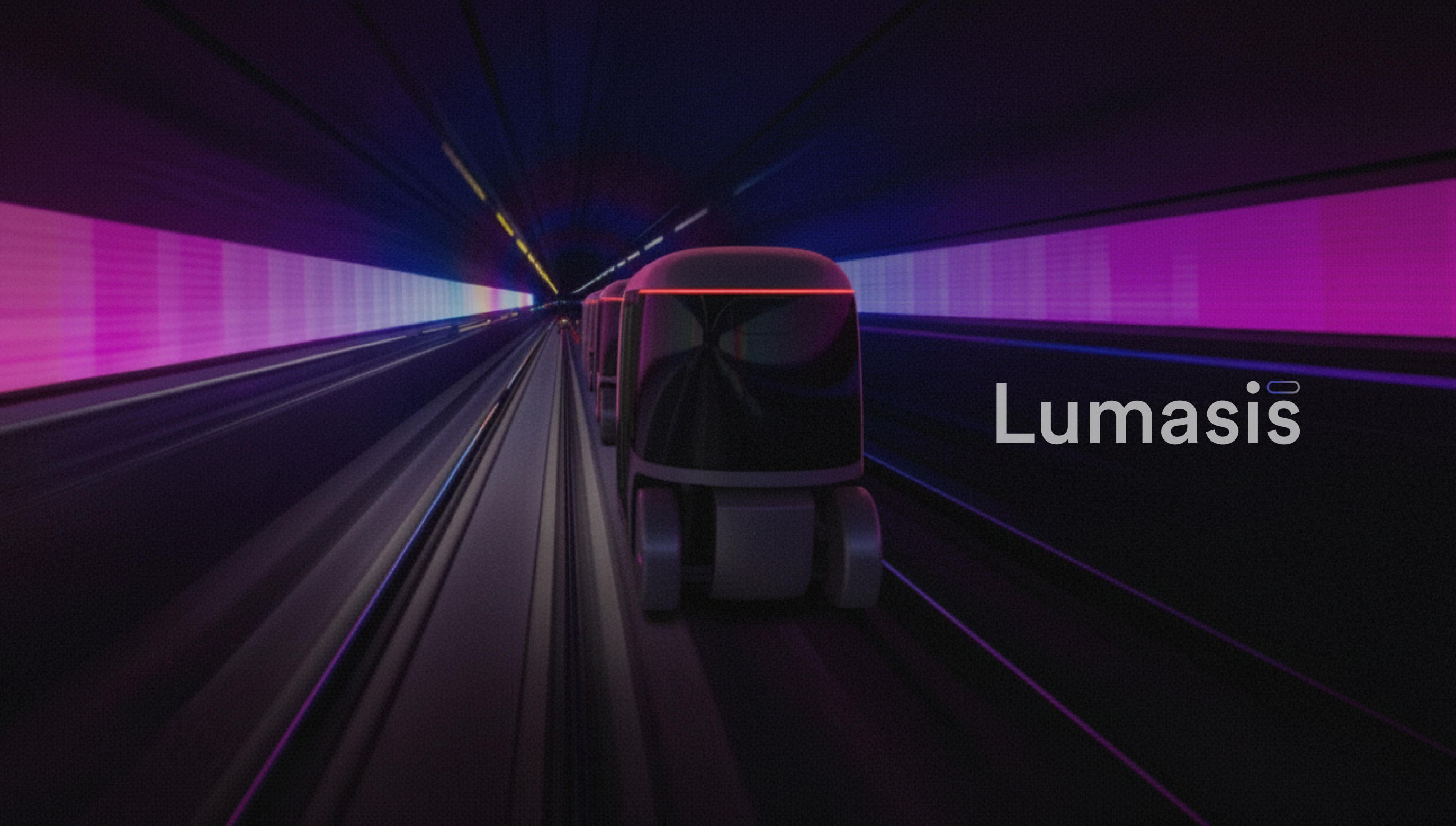
Lumasis case study cover — gradient wordmark and glass track UI on dark background
Company

Glydways

Project
Lumasis Design System
Role
Principal Designer
Surfaces
Design System
Interaction Design
Live Activities & Applications
AI Platforms: Operating Command & Control
Standard
Metro Visual System
Year
2024–2026
Overview

Lumasis is what the Metro standard becomes in software — the vehicles, the rider's phone, the platform kiosks, and the control room. Metro fixes the values; Lumasis decides how they behave when a screen has to change while a vehicle is moving.
Problem
Transit environments are high-stress, high-motion, and multilingual. Riders and operators need information that's immediately legible and behaviorally consistent, especially during disruptions.
Goal
Build a system that doesn't just standardize UI—it calmly guides people through complex environments and makes advanced autonomy easier to understand across product, operations, and storytelling.
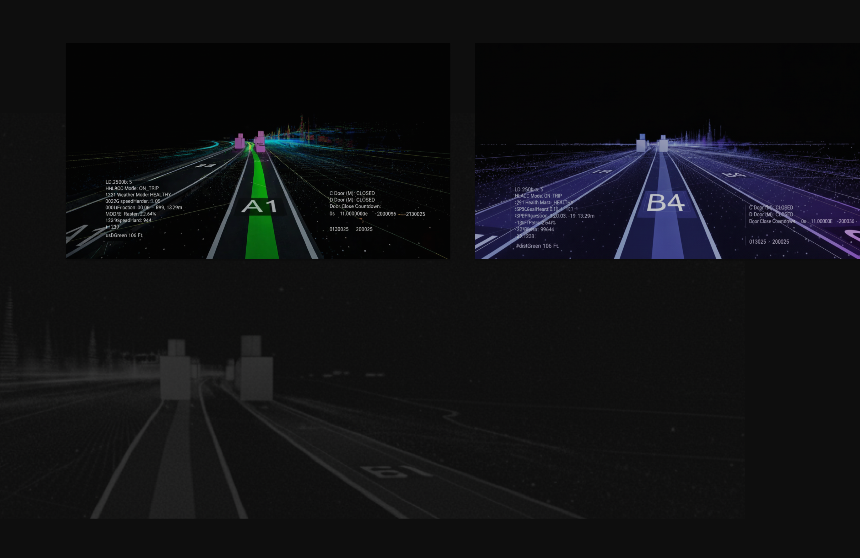
Machine perception views — lane A-1 classified in green and lane B-4 in violet, each with live telemetry, over a ghosted point cloud of the guideway.
Core Thesis

The vehicles don't see the world the way people do — they see sensor data. The visual system is built from that machine perception, not layered on top of it afterward.

Perception

Lumasis was designed as a behavioral system with its own internal logic. It grows from how machines see, sense and make decisions, turning perception itself into the foundation for the visual language.

Metro Visual System

Built on Metro, so palette, icon, type, and motion resolve to four parameters — color, light, material, depth. Every surface inherits the grammar before it inherits a component.
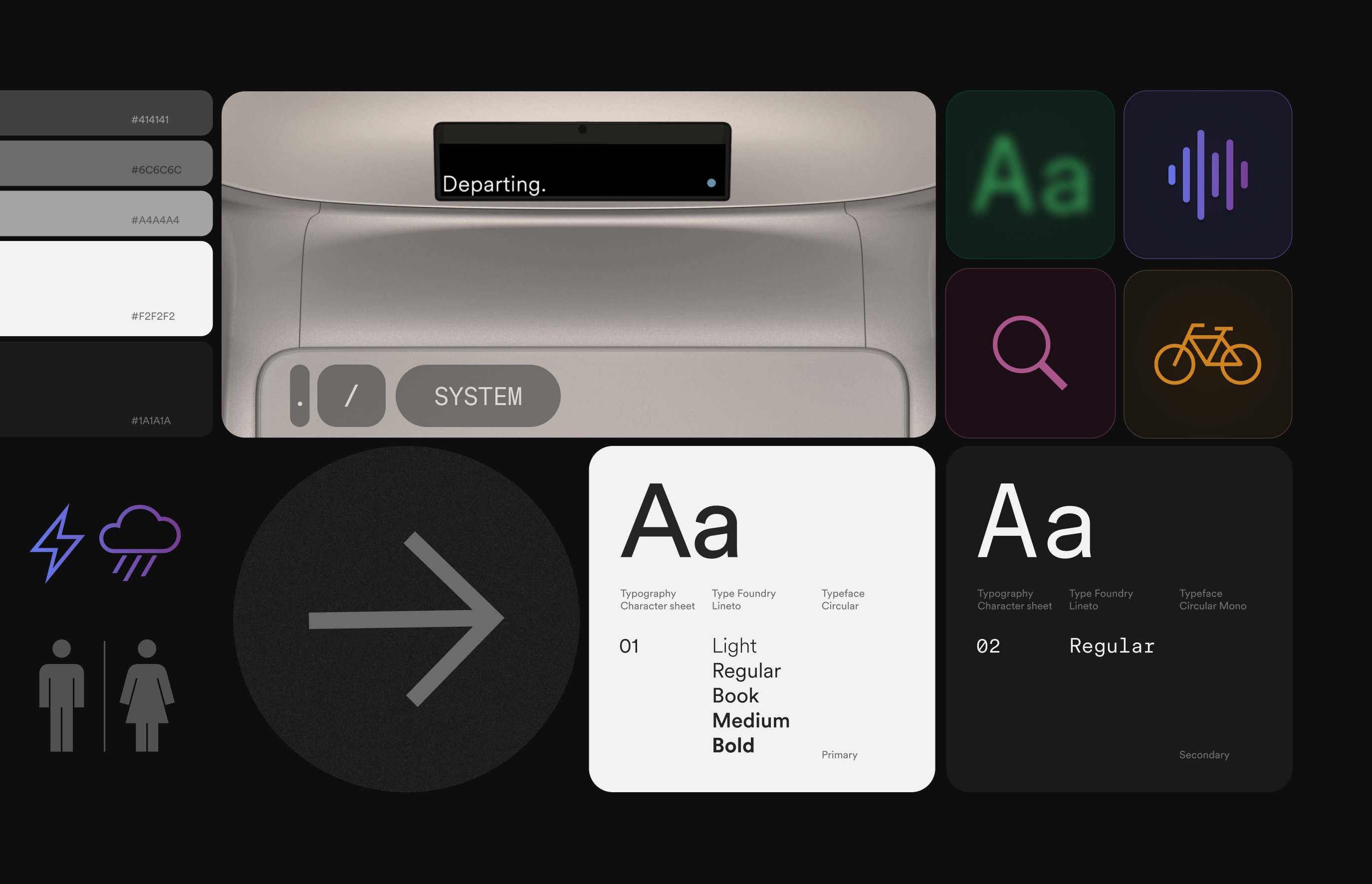
Lumasis visual system board — grayscale value ladder, vehicle display, pictograms, and the Circular type specimens shown as one sheet.
Parameters

Four parameters carry the whole system — color, light, material, depth. Every token below resolves to one of them, so a new surface is specified by naming values rather than by drawing a new component.
Color
Light
Material: Glass
Frosted
Dark
Tinted
Prismatic
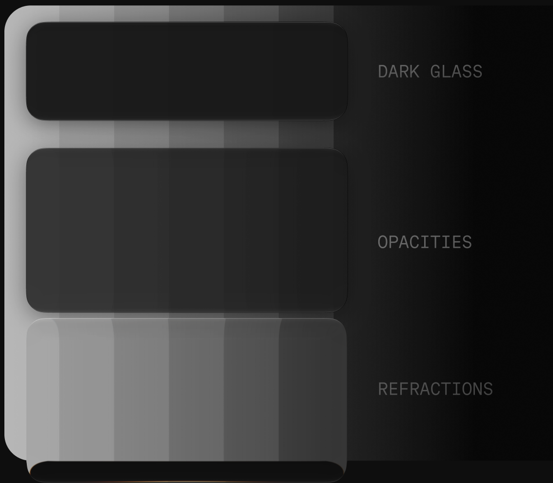
Opacities
Refractions
Depth: Opacity
.05
.11
.19
.28
.40
SwatchFamilyCoreApplied lightΔLToken architecture
Bronzehue 33°#3E2E1Ahsl(33, 41%, 17%)#93744Bhsl(34, 32%, 44%)+27--lum-bronze17 / 44
Amberhue 35°#AA6405hsl(35, 94%, 34%)#ECA74Ahsl(34, 81%, 61%)+27--lum-amber34 / 61
Tealhue 169°#044E41hsl(169, 90%, 16%)#33A68Fhsl(168, 53%, 43%)+27--lum-teal16 / 43
Azurehue 198°#12465Dhsl(198, 68%, 22%)#2C81A5hsl(198, 58%, 41%)+19--lum-azure22 / 41
Bluehue 221°#142B5Chsl(221, 64%, 22%)#2D64DDhsl(221, 72%, 52%)+30--lum-blue22 / 52
Indigohue 241°#292861hsl(241, 42%, 27%)#4A49A9hsl(241, 40%, 47%)+20--lum-indigo27 / 47
Violethue 289°#401E48hsl(289, 41%, 20%)#793989hsl(288, 41%, 38%)+18--lum-violet20 / 38
Magentahue 342°#471222hsl(342, 60%, 17%)#AE3375hsl(328, 55%, 44%)+27--lum-magenta17 / 44
Emberhue 3°#65120Ehsl(3, 76%, 23%)#C44E37hsl(10, 56%, 49%)+26--lum-ember23 / 49
SurfaceMaterialValueCompositionToken architecture
Frostedglassrgba(255,255,255,.045)blur 22px--lum-glass-frosted
Darkglassrgba(0,0,0,.44)blur 22px--lum-glass-dark
Tintedglassrgba(79,73,169,.30)blur 22px--lum-glass-tinted
Prismaticglasslinear-gradient(122deg)magenta · blue · teal at .20--lum-glass-prismatic
Opacitiesglass.05 / .11 / .19 / .28 / .40five steps--lum-glass-opacity-scale
Refractionglasslinear-gradient(100deg).04 · .22 · .04--lum-glass-refraction
Level 1depthrgba(255,255,255,.05)blur 32px--lum-depth-1
Level 2depthrgba(255,255,255,.11)blur 24px--lum-depth-2
Level 3depthrgba(255,255,255,.19)blur 18px--lum-depth-3
Level 4depthrgba(255,255,255,.28)blur 12px--lum-depth-4
Level 5depthrgba(255,255,255,.40)no blur--lum-depth-5

Token names are derived, not assigned. The family comes from the HSL hue and the step from the HSL lightness, so --lum-blue-52 states its own value and two designers naming the same swatch independently arrive at the same token. Core and applied light are one family read at two levels — the applied set is the core color seen through refractive glass at 34%, not a second palette — which is why ΔL is the only number separating them. Depth is carried by blur: 32 · 24 · 18 · 12px, descending as priority rises. Thicker glass diffuses more, so the more urgent something is, the less material sits between it and the reader — a ladder that stays legible in grayscale and without hue.

Glassmorphism

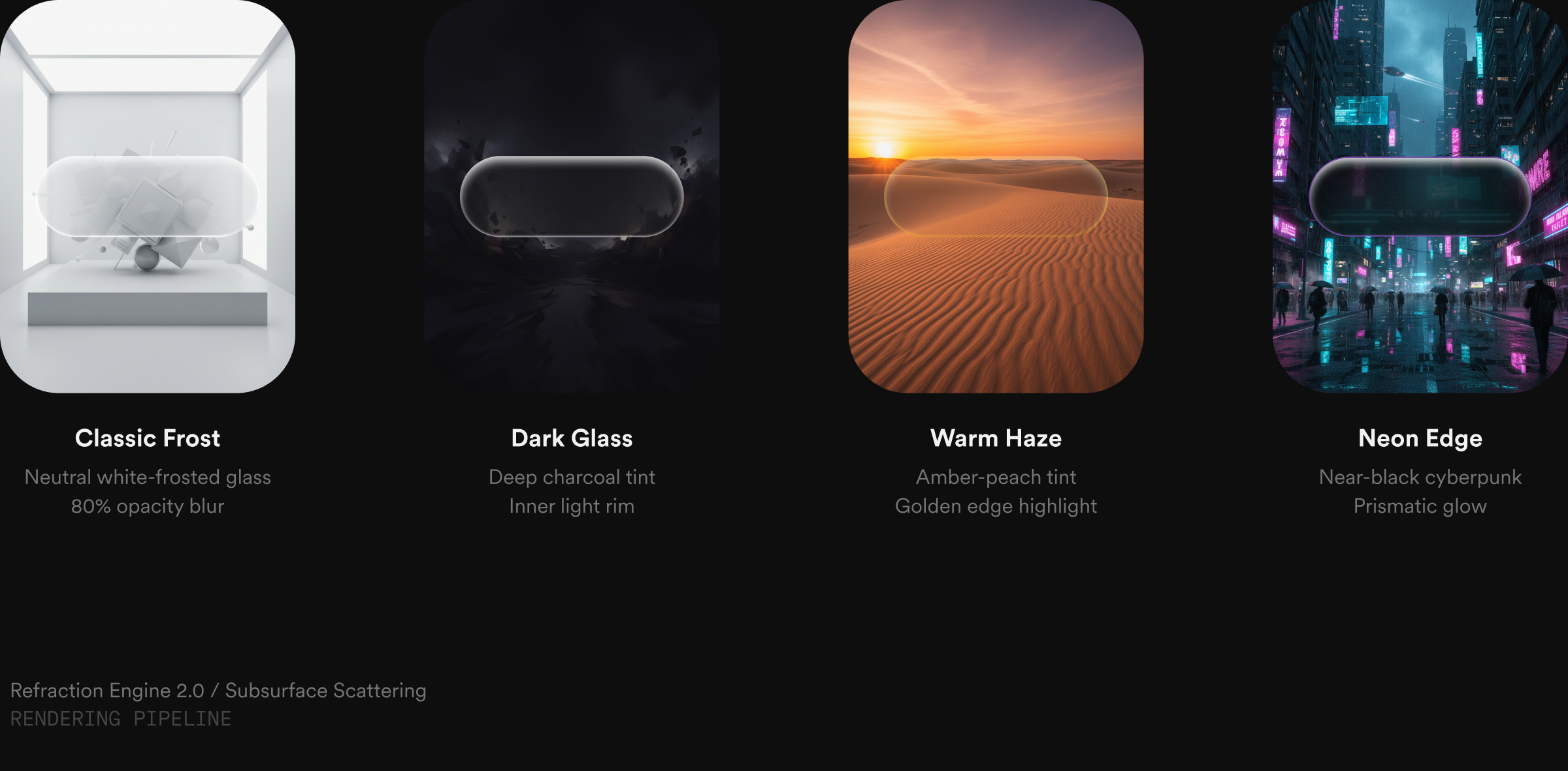
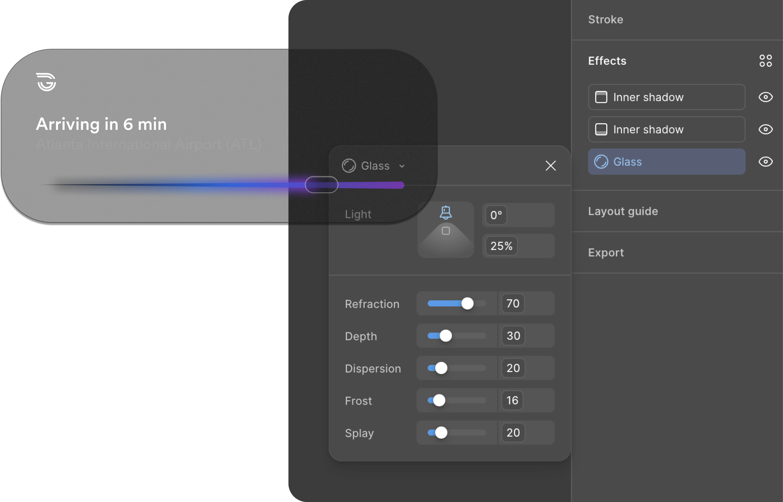
The same pill lens has to read against white frost, black glass, desert light, and neon glow without changing shape. Refraction carries the interface beneath it rather than hiding it, so one shape serves a button, a status pill, and a mode toggle across all four.

Classic Frost
Neutral white-frosted glass
80% opacity blur
Dark Glass
Deep charcoal tint
Inner light rim
Warm Haze
Amber-peach tint
Golden edge highlight
Neon Edge
Near-black cyberpunk
Prismatic glow

Pill token architecture

{
  "pill": {
    "bg": {
      "default":  { "value": "{color.surface.1}" },
      "hover":    { "value": "{color.surface.2}" },
      "pressed":  { "value": "rgba(255,255,255,0.08)" },
      "disabled": { "value": "rgba(255,255,255,0.03)" }
    },
    "text": {
      "default":  { "value": "{color.ink.primary}" },
      "disabled": { "value": "rgba(255,255,255,0.35)" }
    },
    "radius": { "value": "{radius.pill}" },
    "height": { "value": "{size.pillHeightMd}" },
    "stroke": {
      "width": { "value": "{stroke.hairline}" },
      "color": { "value": "rgba(255,255,255,0.14)" }
    },
    "glass": {
      "blur":                  { "value": "{blur.glassMd}" },
      "specularOpacity":       { "value": 0.55 },
      "innerHighlightOpacity": { "value": 0.18 },
      "chromaticShift":        { "value": "0.6px" }
    }
  }
}
Live Activities

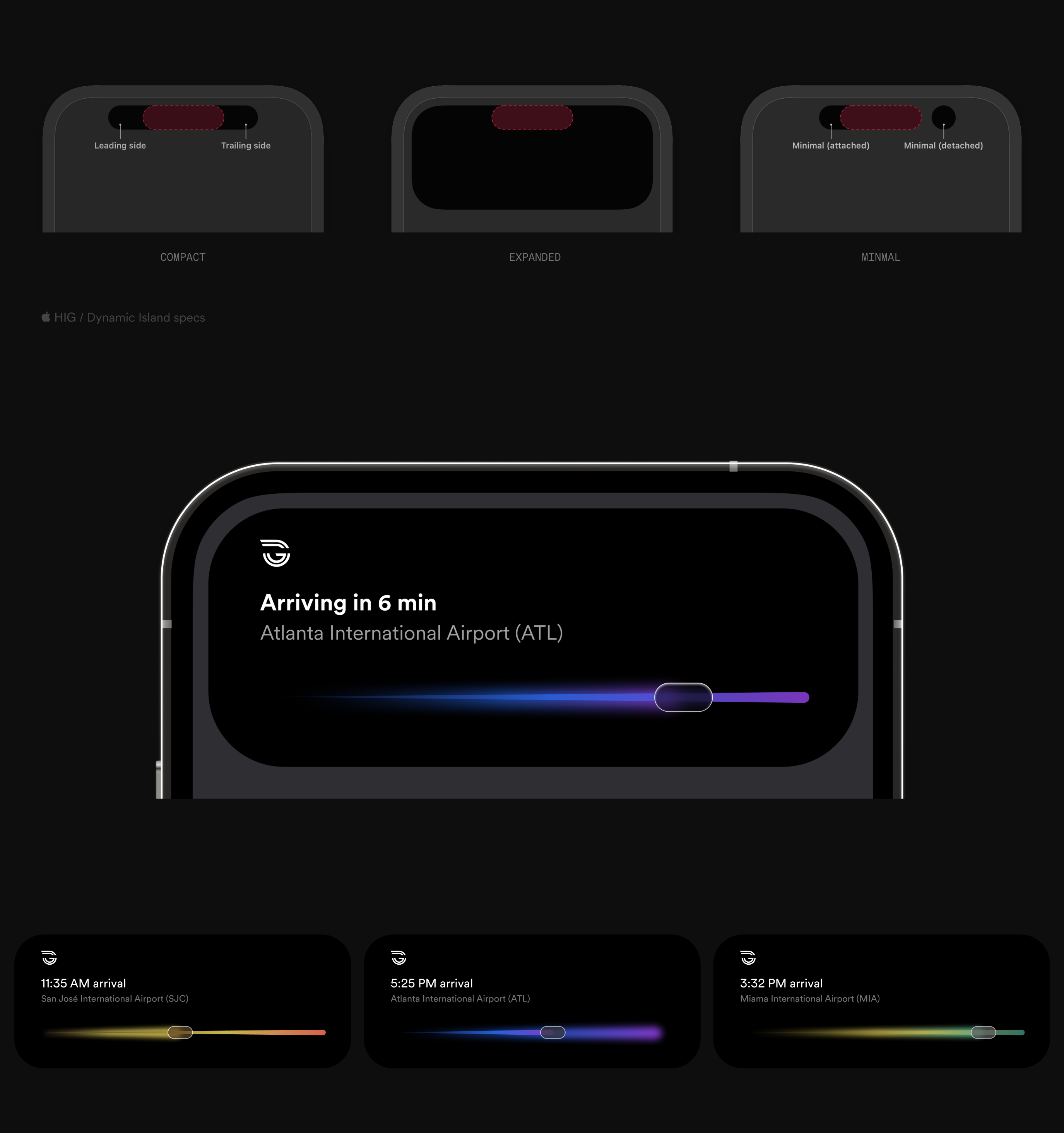
The arrival follows the rider across the Dynamic Island, the Lock Screen, and StandBy, so one activity has to hold from a compact pill to a full screen. The track, the position on it, and the time never drop, and the route's gradient carries the line identity at every size.

Live Activities plate — Dynamic Island compact, expanded, and minimal presentations above a full-screen arrival and three route activities, each with its own gradient.
In motion

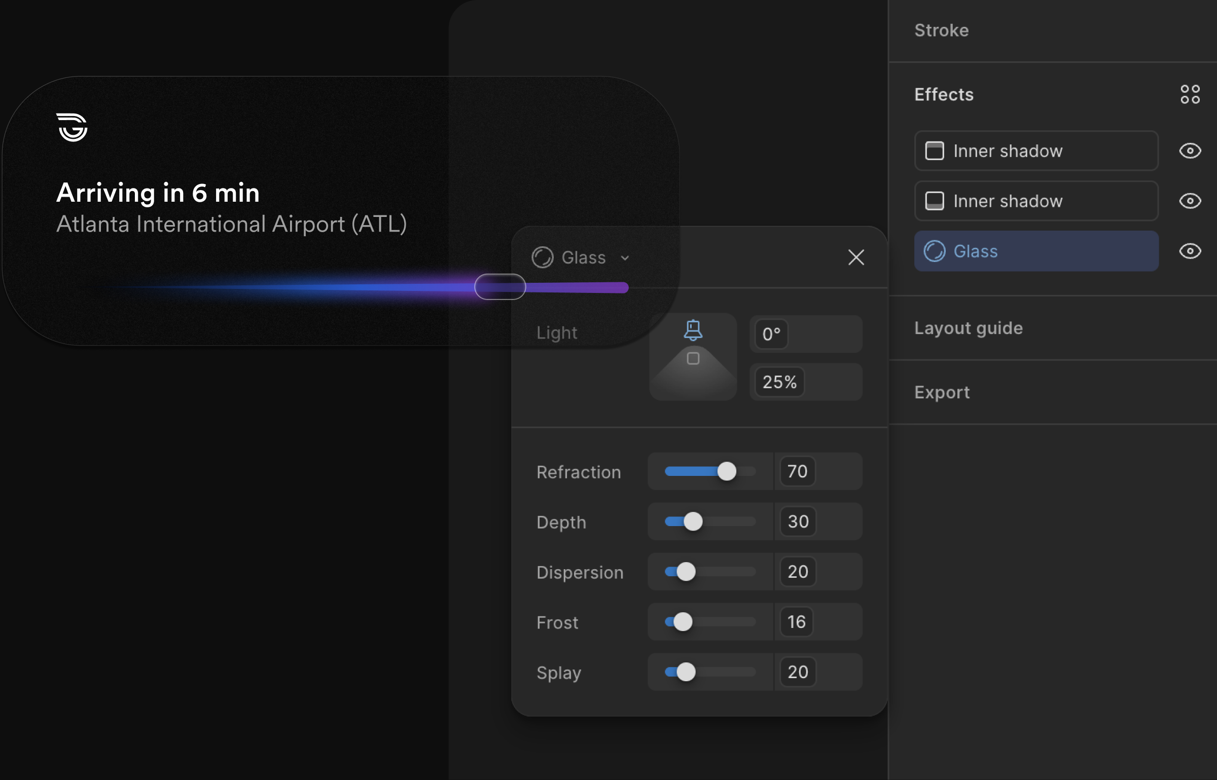
Every value below is a live token rather than a picture of one. The travelled line runs to the pill, and the blur sits just behind it, growing with speed.

Arriving in 6 min
San José International Airport (SJC)
route.gradientlum-ember-49 → lum-amber-61
position18%
trail.blur7px · behind the pill
Derived, not declared

Token names come from the value itself — family from the HSL hue, step from the HSL lightness. Two designers naming the same swatch independently arrive at --lum-blue-52.

RejectedA curated semantic vocabulary. Readable on day one, contested by month three.

ConsequenceNaming stops being a review topic. The token is checkable against its own value.

One family, two levels

Core and applied light are the same family read at two levels — the applied set is the core color seen through refractive glass, not a second palette.

RejectedA parallel palette for dark surfaces. Doubles the token count and lets the two drift apart.

ConsequenceΔL is the only number separating them: 18 to 30 points, which is also what clears AA.

One property, one idea

Depth is carried by opacity alone — five levels, .05 → .40, against a blur that never changes. Blur moved to motion, where it measures the gap between a moving object and the line it leaves behind.

RejectedA parallel blur ladder stepping down as priority rises. Two properties expressing one idea, disagreeing at the edges.

ConsequenceDepth is a single number an engineer can read off a token, and blur became a function of velocity rather than a decoration.

Accessibility
Contrast

A dark theme with glowing accents has to clear WCAG AA[1] on every primary text and control; each applied value sits 18 to 30 points of lightness above its core.

Glass

Frosted, Dark, Tinted, and Prismatic all carry text at the same lightness-lifted values, so contrast doesn't reset depending on which surface a control lands on.

Operations

The same lightness thresholds hold in the Command & Control view, where a missed color read costs more than it does on a platform sign.
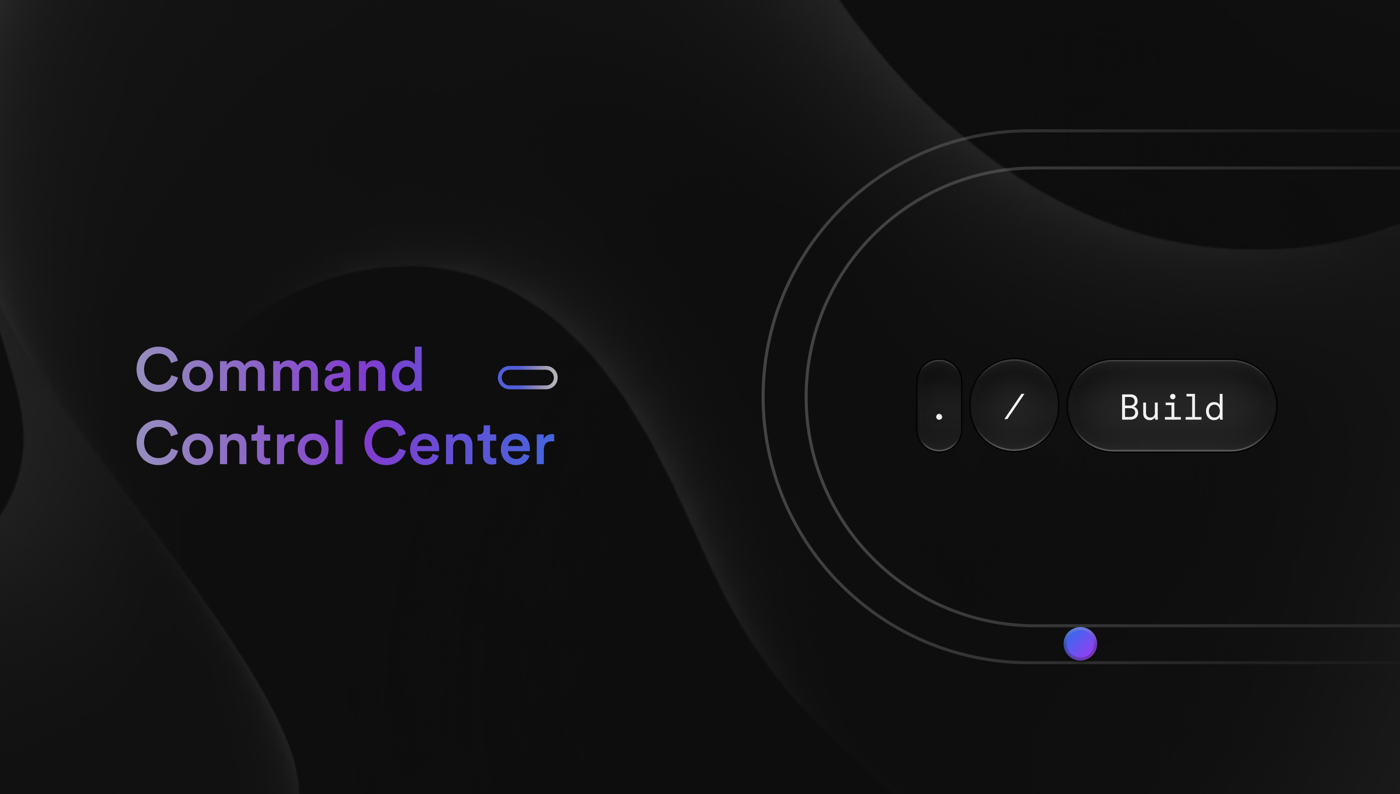
Command Control Center title card — gradient wordmark on near-black with glass controls and a guideway loop.
Operations Command & Control

The operator sees the same lane guidance and classification-confidence data the vehicle uses, not a translation of it — same color logic, same type scale, same iconography, at fleet scale. One system serves the person taking a ride and the person watching twenty, and a wrong read costs more at the second.
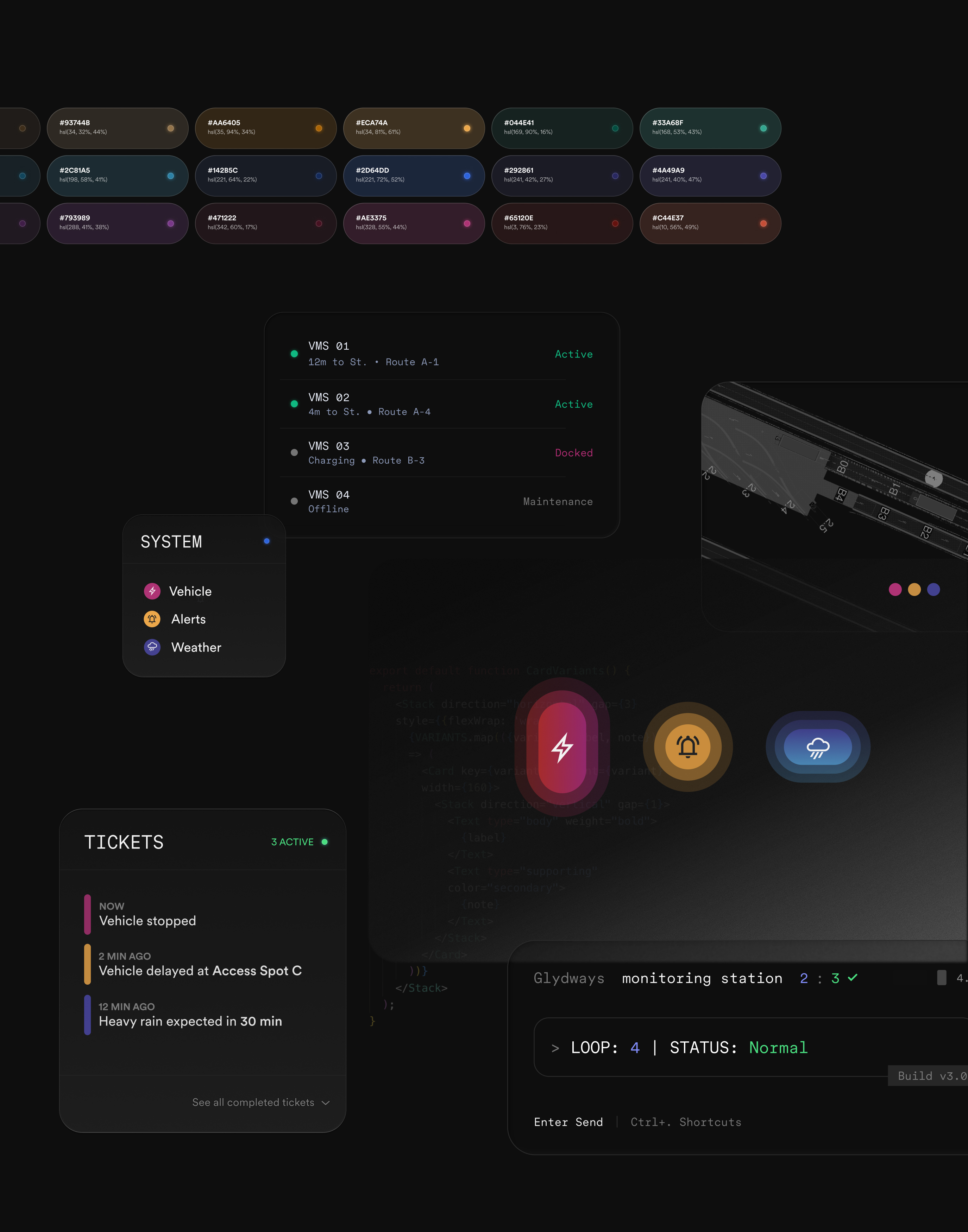
Operations control center components with a color token swatch row above vehicle status list, alerts icons, and a monitoring terminal.
The Outcome
A rider on a platform can tell what the vehicle is about to do, and an operator watching twenty can tell which one needs attention. Both are reading the same signals the vehicles use to see.
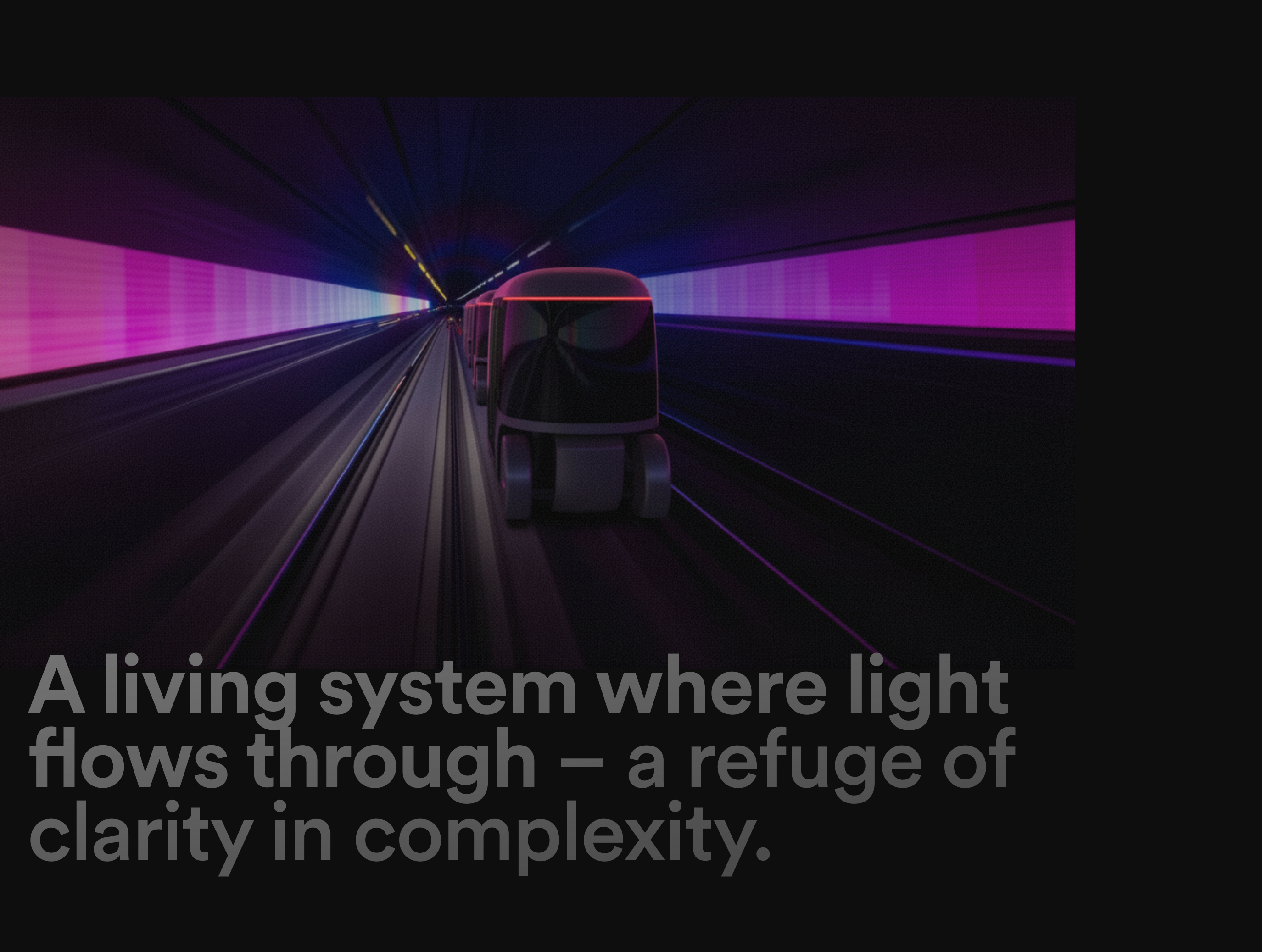
A living system where light flows through — a refuge of clarity in complexity, over an image of an autonomous transit vehicle in a neon-lit tunnelDark glass material reference: opacity and refraction swatchesLumasis design system detail from FigmaLumasis design system detail, secondary view from Figma
Glydways standards manual coverGlydways Brand Guidelines cover